If you’ve been in my orbit as a student or colleague, you’ve probably heard me reference one of these. They’re the books I come back to when I want to stay intellectually honest about what we’re doing with data, especially when the numbers look “too good” in a messy world.
What I like about them is that they pull the conversation away from “what model should we use?” and toward the questions that actually decide whether data science helps or quietly makes things worse.
Because once you’ve built a few models, you learn that the technical work is only one component. The real risk (and the real value) sits in the system around it: how the data was collected and manipulated, who the outputs affect, what incentives the metric creates, and whether the work changes a decision in a defensible way.
If we deploy this at scale, where can it cause harm or lock in bad incentives?
Whose reality is missing from the data and what does that omission enable?
Can I communicate this in a way that is honest, testable, and action-guiding?
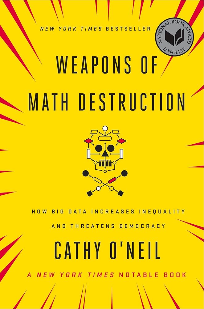
1) Weapons of Math Destruction — Cathy O’Neil
Weapons of Math Destruction gave me a very specific kind of scepticism: it helps me spot when a model is learning the organisation’s past behaviour and then scaling it as if it were truth.
O’Neil’s example of criminal risk scores makes this uncomfortably clear. These models are often trained on historical records that look like “facts” but are really the output of a system, shaped by where policing was concentrated, who was stopped and charged, what plea deals were offered, and how prior decisions accumulated over time. Train on that history and the model can end up predicting exposure to law enforcement as much as it predicts anything about behaviour.
The problem isn’t only that the score might be wrong, it’s what happens when it becomes an input into high-stakes decisions like bail and sentencing while remaining hard to interrogate or contest. Someone labelled “high risk” is more likely to be detained, monitored, and placed under stricter conditions; that added scrutiny increases the chance of recorded violations, even minor ones, which then flow back into the data as if they were objective evidence of risk. Meanwhile, people and places monitored less intensely generate fewer recorded incidents, which can be misread as lower risk. The model doesn’t just describe the world; it helps reproduce it.
Questions I actually ask in reviews:
- What exactly are we optimising and what behaviour will that metric reward?
- Who experiences the cost of false positives and false negatives?
- If someone is harmed by this decision, can they appeal it? If not, why are we comfortable?
- What is our monitoring plan for unintended consequences?
For students, this is the point where data science becomes more than “train/test split.” It becomes: how do models shape real outcomes once they leave the notebook?
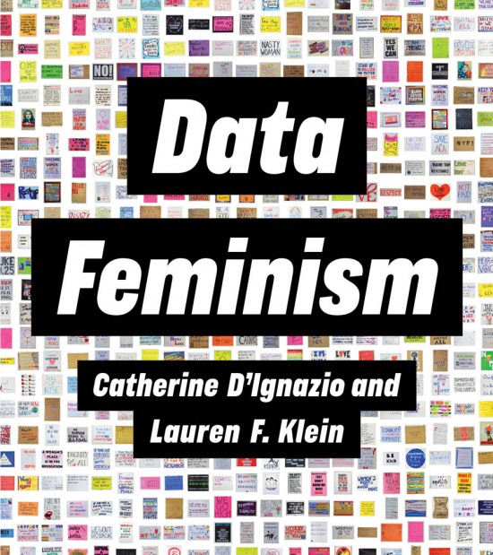
2) Data Feminism — Catherine D’Ignazio & Lauren F. Klein
The most useful contribution of Data Feminism is that it frames bias as structural, not incidental. Bias isn’t a little bit of noise you clean out with better preprocessing. It often sits in definitions, categories, data collection, and whose experiences get recorded at all. And it’s not only “in the data”; it’s also in the choices we make as data scientists, the defaults we accept, the assumptions we inherit, and the questions we don’t think to ask.
A health care example makes this real. For years, medical research and clinical datasets have often treated the male body as the default, with women under-represented in trials and women’s symptoms described as “atypical.” When the baseline is skewed, models and guidelines can systematically under-detect risk for women not because the modelling is sloppy, but because the evidence base is uneven.
Questions I use with this lens:
- Who is not represented here, and what decisions are we still making about them?
- What social or operational process generated these labels?
- Where do we collapse important differences into a single number because it’s easier to report?
- When you segment results, look for groups that consistently get worse outcomes or higher error rates. If the same group underperforms across slices, don’t default to “they’re harder to predict” or “they behave differently.”
For students, it’s an upgrade from “watch out for bias” to “learn to locate where it enters, and what it enables.”
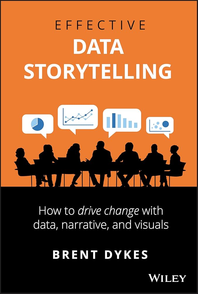
3) Effective Data Storytelling — Brent Dykes
This is the bridge between insight and action. Most organisations don’t fail because they lack analysis. They fail because analysis doesn’t change decisions or because decisions change for the wrong reasons.
Dykes’ work is valuable because it treats communication as part of the technical craft. A good story isn’t decoration. It’s a structure that forces you to be explicit about what you know, what you don’t, and what should change as a result.
What it improves immediately:
- You stop presenting “findings” and start presenting decision implications.
- You make uncertainty legible without burying it.
- You anticipate the sceptical questions and build the evidence chain upfront.
Questions I use before I share anything:
- What decision is this analysis meant to inform?
- What don’t we know yet, and how could that change the conclusion?
- What else could plausibly explain this pattern?
- Which chart would my most sceptical colleague ask for first?
For students, this lens prevents a common outcome: technically correct work that nobody could act on. It turns an assignment into an argument with evidence.
Putting it together
As AI gets cheaper to ship and more convincing to look at, these checks matter more, not less. The future won’t be won by the model that scores highest, but by the teams that stay honest about what they’re optimising and who pays for it. Because “good performance” can still be the wrong objective. And “clean storytelling” can still be persuasive in the service of something flawed. Critical thinking is what keeps you from optimising the wrong thing confidently.